How large is the American public sector? Who actually raises public revenues? How much funding flows between the federal, state, and local levels before public services are ultimately delivered? Does the public sector provide good value for money?
Answering these questions is no easy task, as the institutional architecture of American fiscal federalism is extraordinarily complex. Public resources are raised through multiple revenue instruments at different levels of government, redistributed through intergovernmental transfer systems, and ultimately used to finance the delivery of public services by federal, state, and local governments.
Although the underlying data are generally readily available, capturing the overall structure of public finances and achieving insight in the intergovernmental fiscal structure of the United States is surprisingly difficult. Revenues, expenditures, and intergovernmental transfers are typically presented in separate statistical tables, making it challenging to visualize how public resources move through the system as a whole.
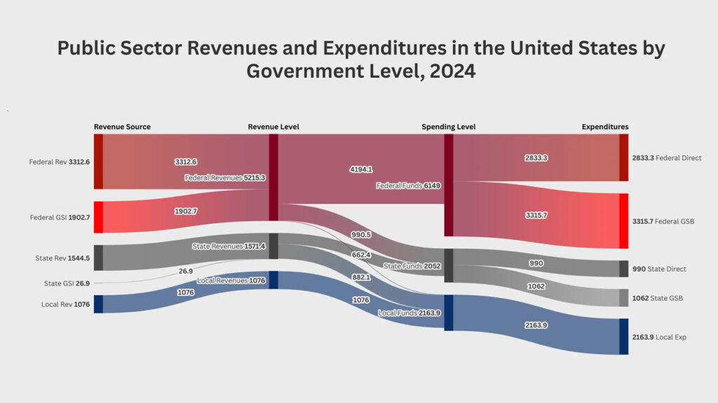
To address this challenge, using Bureau of Economic Analysis (BEA) data for federal, state and local government finances for 2024, I developed the interactive diagram below. The visualization integrates the principal revenues, expenditures, and transfer flows into a single representation of the American public sector. Rather than depicting separate government budgets, the diagram illustrates the financial relationships that link the three levels of government into a single fiscal system.
The diagram: From revenues to expenditures
Note that the diagram is best viewed on wider screens, and may not display well on mobile devices.
The Sankey diagram follows public resources through four distinct stages. Taken together, these four stages provide an integrated picture of the fiscal architecture of the United States.
The first column presents the principal sources of public revenue, distinguishing between revenues raised directly by federal, state, and local governments, as well as government social insurance (GSI) contributions at the federal and state levels. The second column aggregates these revenues by level of government, providing the total revenues initially available to each level of government.
The third column introduces the intergovernmental dimension of the public sector by explicitly incorporating intergovernmental transfers. Federal grants to state and local governments, together with state transfers to local governments, substantially reshape the distribution of fiscal resources before expenditures occur.
The final column presents expenditures by the level of government ultimately responsible for service delivery. This distinguishes direct federal expenditures from direct expenditures carried out by state and local governments, irrespective of the original source of financing. In addition, the diagram acknowledges the considerable federal and state-level spending on government social benefits (GSB), which reflects government transfers to persons, rather than ‘regular’ government spending on public infrastructure and services.
Data source and limitations
The visualization is based primarily on the Bureau of Economic Analysis’ National Income and Product Accounts (NIPA), which are designed to present national economic accounts in a consistent manner rather than to support a detailed accounting of individual government budgets. As a result, the underlying data are compiled on an economic accounting basis and differ in important respects from administrative budget and financial reporting systems such as the Census of Governments or governments’ Annual Comprehensive Financial Reports (ACFRs). At the same time, the NIPA framework provides a consistent and internally coherent view of the entire public sector, making it particularly well suited for illustrating the magnitude and direction of fiscal flows across levels of government within the national economy.
The diagram necessarily aggregates numerous revenue and expenditure categories and simplifies complex intergovernmental financial relationships. For instance, many federal and state grant programs are consolidated into broad intergovernmental transfer flows, while certain accounting adjustments, trust fund transactions, and financial asset transactions are excluded consistent with the treatment in the national accounts. In some cases (e.g., provision or receipt of capital transfers), certain assumptions had to be made, as the NIPA source data fails to provide a detailed breakdown of the originating or recipient government level. With these minor caveats, the diagram accurately reflects the intergovernmental distribution of resources in the United States in line with the BEA NIPA data source.
It is further important to recognize that the diagram presents national totals and national (per capita or per household) averages, as the source data does not provide per-state or per-locality details. Other data sources are more suitable for state-level or local-level analyses that would reveal state and local-level variations in revenues or expenditures.
Multiple ways of measuring public sector funding flows
It should further be noted that the visualization of intergovernmental fiscal funding flows across different levels can be displayed using four alternative units of measurement (note the selector at the top-left-hand corner of the diagram):
The first presents aggregate amounts in billions of dollars, providing a conventional macro-fiscal perspective.
Given that few people are able to contextualize billions or trillions of dollars of public sector spending across a country with 340 million residents and over 132 million households, the second metric expresses each flow on a per person or per capita basis, which makes the revenue and expenditure amounts more relatable and facilitates comparisons across jurisdictions and over time.
The third and fourth units of measurement normalize fiscal flows on a per household basis, expressed either annually or monthly. Although economists often default to aggregate or per capita measures, the household-based measures may prove particularly valuable for communicating public finance to broader audiences. Households naturally organize their private finances in monthly terms. Presenting the public sector using the same unit of analysis provides a more intuitive representation of the scale of taxation and public service provision. While economically equivalent, these alternative framings encourage different ways of thinking about the role of the public sector.
What does the diagram reveal about public sector finance and performance?
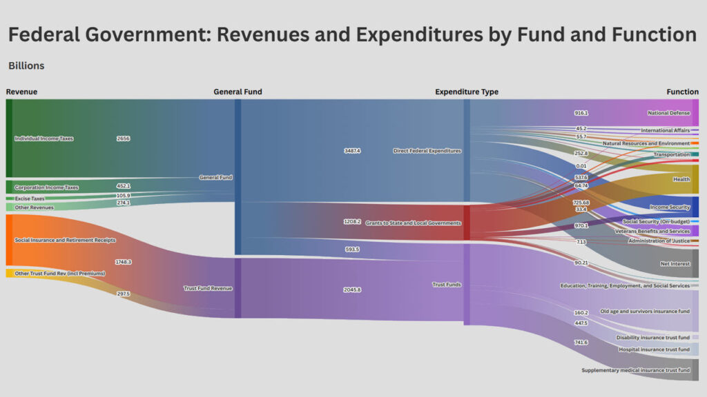
Even before diving into the numbers, several structural characteristics of American fiscal federalism become immediately apparent. First, the diagram highlights that the federal government raises the majority of public revenues—while there is a major budget imbalance at the federal level between revenues and expenditures. Second, intergovernmental transfers constitute a central feature of the fiscal system rather than a peripheral adjustment. Third, state governments simultaneously function as spending governments and as intermediaries within the intergovernmental transfer system. Fourth, local governments ultimately account for a substantially larger share of public expenditures than would be suggested by their own-source revenues alone. And finally, the diagram reveals the critical role of government social programs in public spending, especially at the federal and state levels. At these levels, more than half of direct public spending is directed towards social protections program—much of which is excluded from the general budget and ring-fenced in separate (federal and state) funds outside the discretionary reach of federal and state legislators. As a result, it is important to recognize this spending as separate from regular government investments and spending programs at the .
While each of these observations are individually well understood within the fiscal federalism literature, the value of the diagram lies in bringing these issues together simultaneously within a single integrated visualization.
Beyond illustrating the structure of fiscal relationships, the diagram reveals the overall scale of the American public sector. While macro-fiscal analysis naturally focuses on aggregate expenditures measured in trillions of dollars, such figures are difficult to interpret outside professional circles. Expressing the same fiscal aggregates on a per-household basis provides a more intuitive benchmark for understanding the size of the public sector, placing government expenditures alongside the monthly budgets that households routinely use to assess their own spending. The ability to move seamlessly between these different perspectives is one of the principal strengths of the interactive visualization.
In 2024, consolidated public expenditures amounted to approximately $10.4 trillion (with a “T”), equivalent to roughly $78,000 per household per year, or about $6,500 per household per month. For context, median household income in the United States in 2024 was $83,730 (or roughly $7,000 per month) while mean family income was higher at $144,500 (or slightly over $12,000 per month).
With this in mind, the diagram above shows that the average American household contributed close to 5,000 dollars per month to the public sector through taxes and mandatory social insurance contributions. Roughly two-thirds of these payments ($3,287) flow directly to the federal government and its trust funds, while state governments collect about $990. In turn, local governments collect about $678 in revenue per household per month.
In exchange for the taxes paid to their federal, state, and local governments, the average American household ultimately received approximately $6,533 per month in publicly financed infrastructure, services and benefits. On average, each U.S. household receives approximately $1,786 per month in direct federal services (such as national defense, veterans’ services, payment on national debt, and federal administration), $624 per month in direct state services (including higher education, corrections, state highways, and state administration), and $1,364 per month in local public services (primarily K–12 education, police and fire protection, local roads, water and sewer services, parks, and other community services). In addition to the $3,774 per month in direct government services, American household on average receive approximately $2,759 per month in cash or in-kind government social benefits, including Social Security, Medicare, Medicaid, unemployment insurance, veterans’ benefits, and similar transfer programs.
A detailed analysis of what functions each government level (federal, state and local) spends on, how much, and whether each level of government (or any state of local government) provides good value-for-money is left for subsequent analysis. These figures, however, provide average revenue and expenditure benchmarks across different government levels that can serve as the basis for future comparative analysis.
Concluding thoughts
Ultimately, the purpose of this visualization is not to advocate for a larger or smaller public sector, nor to suggest that current patterns of taxation and spending are optimal. Rather, it seeks to strengthen the factual foundation on which citizens, policymakers, and researchers evaluate the role and performance of government in the American federal system.
In an era when public debate is increasingly shaped by fragmented information, political narratives, and social media, informed democratic decision-making depends on a shared understanding of the basic architecture of the public sector—who raises revenues, how resources are redistributed across levels of government, and what services and benefits citizens receive in return. As the OECD has recently argued, improving public understanding of public finances is becoming an essential part of modern budgeting because governments that communicate fiscal realities clearly and ground policy debates in evidence are better positioned to earn public trust and sustain difficult policy choices. By making these fiscal relationships visible, this Sankey diagram aims to contribute, in a small way, to a more informed public conversation about taxation, public spending, fiscal sustainability, and the value citizens receive from government.