
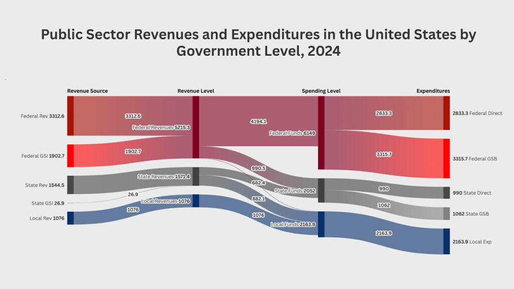
How large is the public sector? Who actually raises public revenues? How much funding flows between the federal, state, and local levels before public services are ultimately delivered? To help answer these questions, an interactive diagram of American Fiscal Federalism traces public revenues from their source, through intergovernmental transfers, to the level of government that ultimately spends the money.
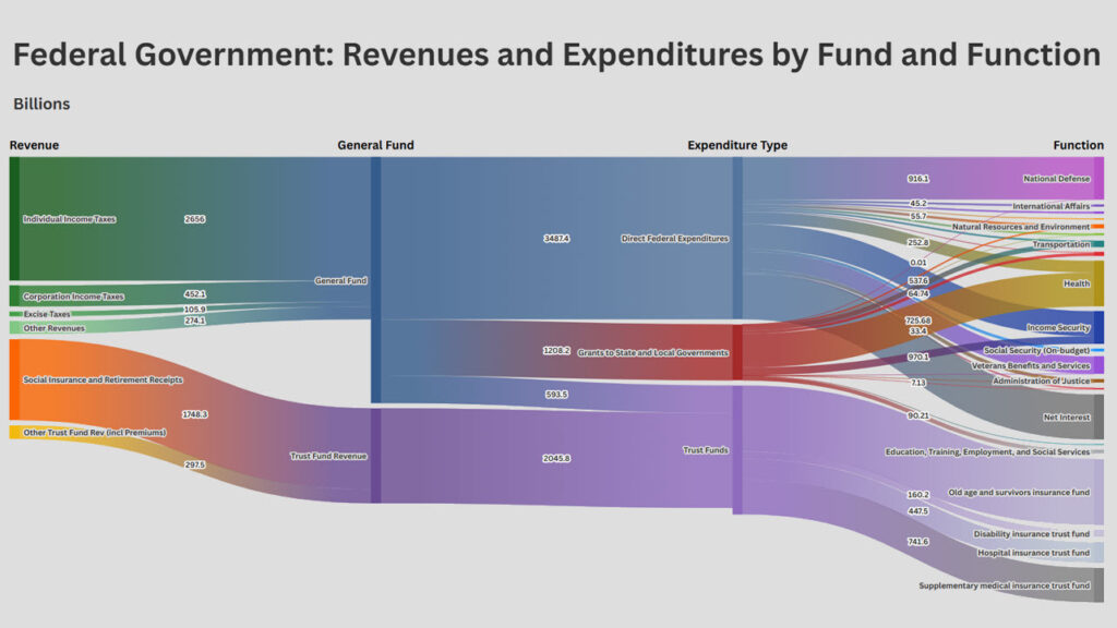
How much do Americans pay in taxes and revenues to the federal government, and what do they get in return in terms of federal government spending programs? This analysis considers the main revenues, expenditures, and intergovernmental fiscal transfers–by fund and function–for the Government of the United States for FY 2025. Unlike more rudimentary presentations of federal government finances, the analysis divides federal revenues and spending between the U.S. General Fund (i.e., the regular federal budget) and the main federal Trust Funds (including the Old Age and Survivors Insurance; the Disability Insurance; Hospital Insurance; and the Supplementary Medical Insurance Trust Funds).
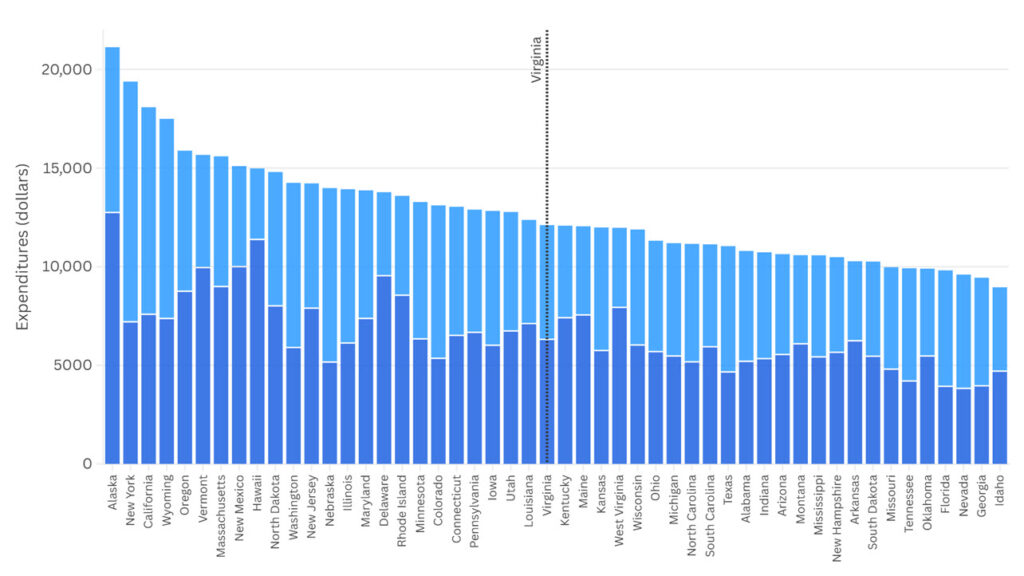
One way to figure out whether government spending in a state is (too) high, (too) low, or about right, is to compare government spending across different states. In order to adjust for the fact that different states have different population sizes, such comparison are typically done in per-person (or possibly, per-household) terms. Relying on the Census of Government Finance data set for 2022, state and local government spending can be explored in a bar diagram, ranking states from the highest-spending state per person (Alaska) to the lowest-spending state (Idaho).